
Microsoft Defender for Endpoint produces an enormous amount of security signal: thousands of CVEs, dozens of misconfigurations, and a steady stream of alerts. Getting data was never the hard part. The hard part is knowing which numbers actually tell you whether your risk is going up or down, and which ones are just noise.
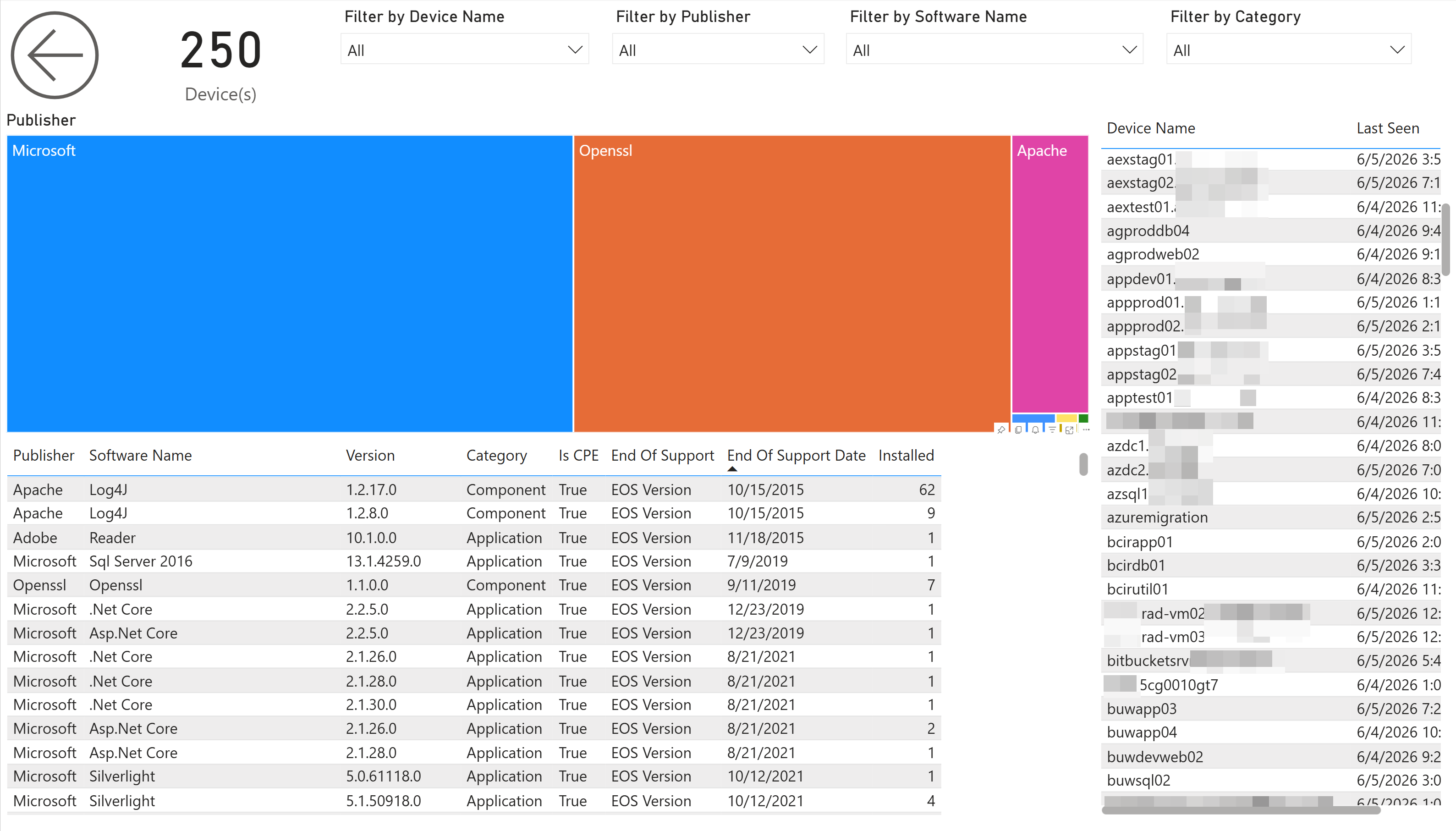
These are eight metrics worth tracking, what each one means, and how to read it without drowning in the rest. The screenshots come from BI for Defender, which turns your Defender for Endpoint data into Power BI reports, but the metrics themselves are universal. Track them however you pull your data.
The eight metrics, in priority order:
- Exposure score: your single headline measure of overall risk
- Exploitable vulnerabilities and exposed devices: your real priority queue
- Vulnerabilities by severity: triage and trend direction
- Prioritized remediation: the single fixes that close the most risk
- Patch lag: how long known fixes sit unapplied (your MTTR proxy)
- Secure Score and misconfigurations: the posture gaps scanning misses
- End-of-life operating systems and software: permanent, growing holes
- New-vulnerability velocity: whether you’re keeping up
1. Exposure score
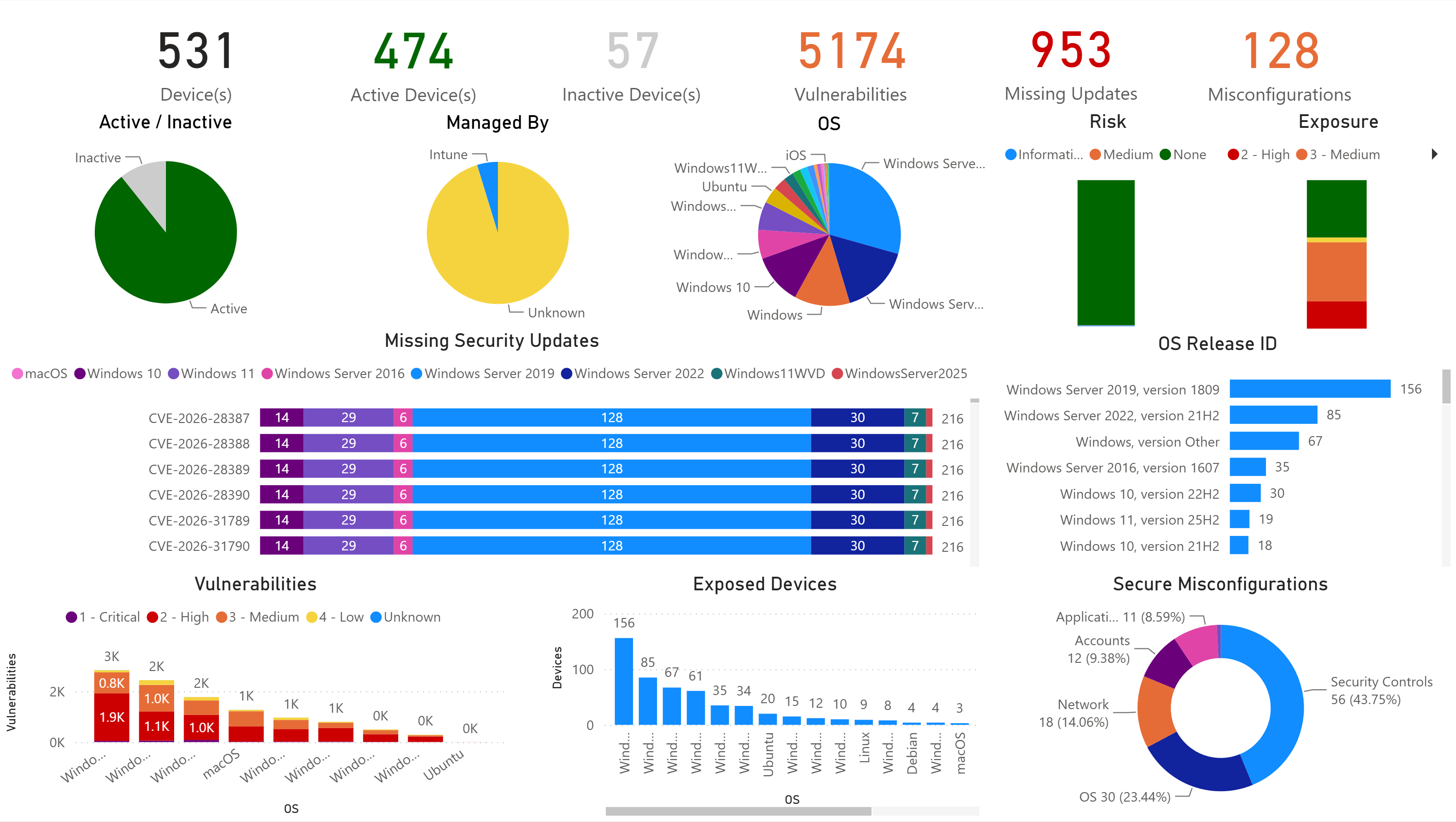
Your exposure score is the single number that answers “how much risk are we carrying right now?” It rolls vulnerabilities, misconfigurations, and exploitability into one figure, which makes it the metric to put in front of leadership. Nobody on a board wants a list of 5,000 CVEs. They want one number, and they want to watch it trend down.
Track it as your headline. If it’s climbing, something upstream is getting worse (new exposures, slipping patches, drifting configuration) and the metrics below tell you which.
2. Exploitable vulnerabilities, and the devices they expose
Exploitable vulnerabilities are the CVEs in your environment that have a known, available exploit. The metric to track is how many you have and how many devices they reach. That focus matters because severity on its own is misleading: a “critical” CVE with no known exploit is often less urgent than a “high” that’s being actively weaponized.
This is the one that changes behavior. Ranking by exploitability and affected device count turns “we have thousands of CVEs” into “patch these few things and you close most of the real risk.” A vulnerability that’s exploitable and sits on 200 machines is your problem today. A critical-rated one with no exploit on two machines can wait.
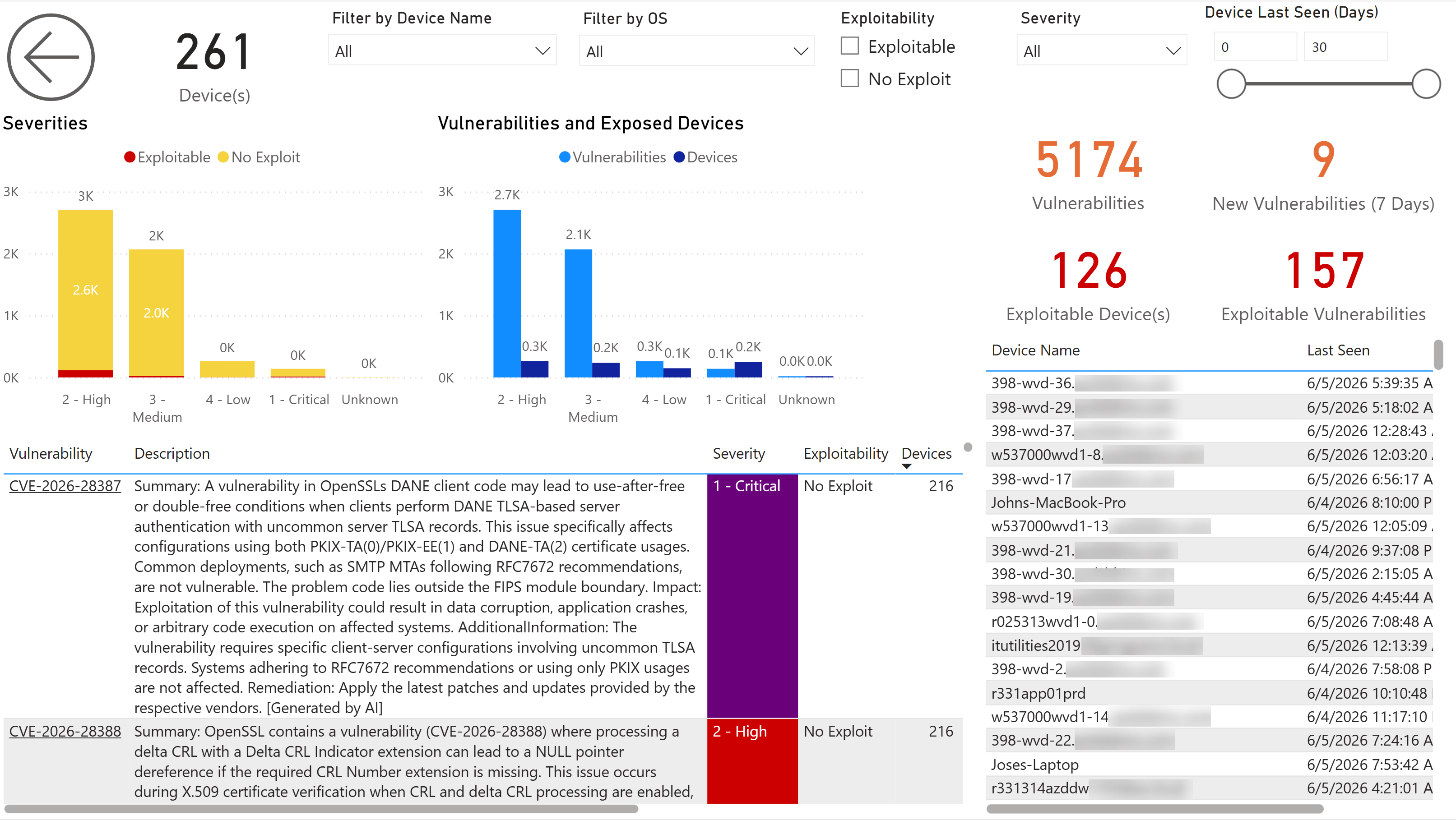
Track exploitable vulnerabilities and exploitable devices as a pair, and treat that pair as your real priority queue.
3. Vulnerabilities by severity
Severity still matters. You just read it alongside exploitability, not instead of it. A severity breakdown is useful for triage and for trend: are criticals and highs growing or shrinking over time, and which operating systems carry the most?
Watch the distribution, not just the total. A flat total that’s quietly shifting toward more criticals is worse than a bigger total that’s mostly lows.
4. Prioritized remediation: what to patch first
Once you know what’s exploitable and where, the next question is which single action closes the most risk. The most useful version of this metric ranks remediations by exposure impact (the risk reduction you’d get from each fix) and by how many devices and vulnerabilities each one clears.
That turns patching from a backlog into a plan. The top item might be one Windows cumulative update that resolves twenty-two vulnerabilities across your fleet. Hand that list to your patching team and they know exactly where to start.
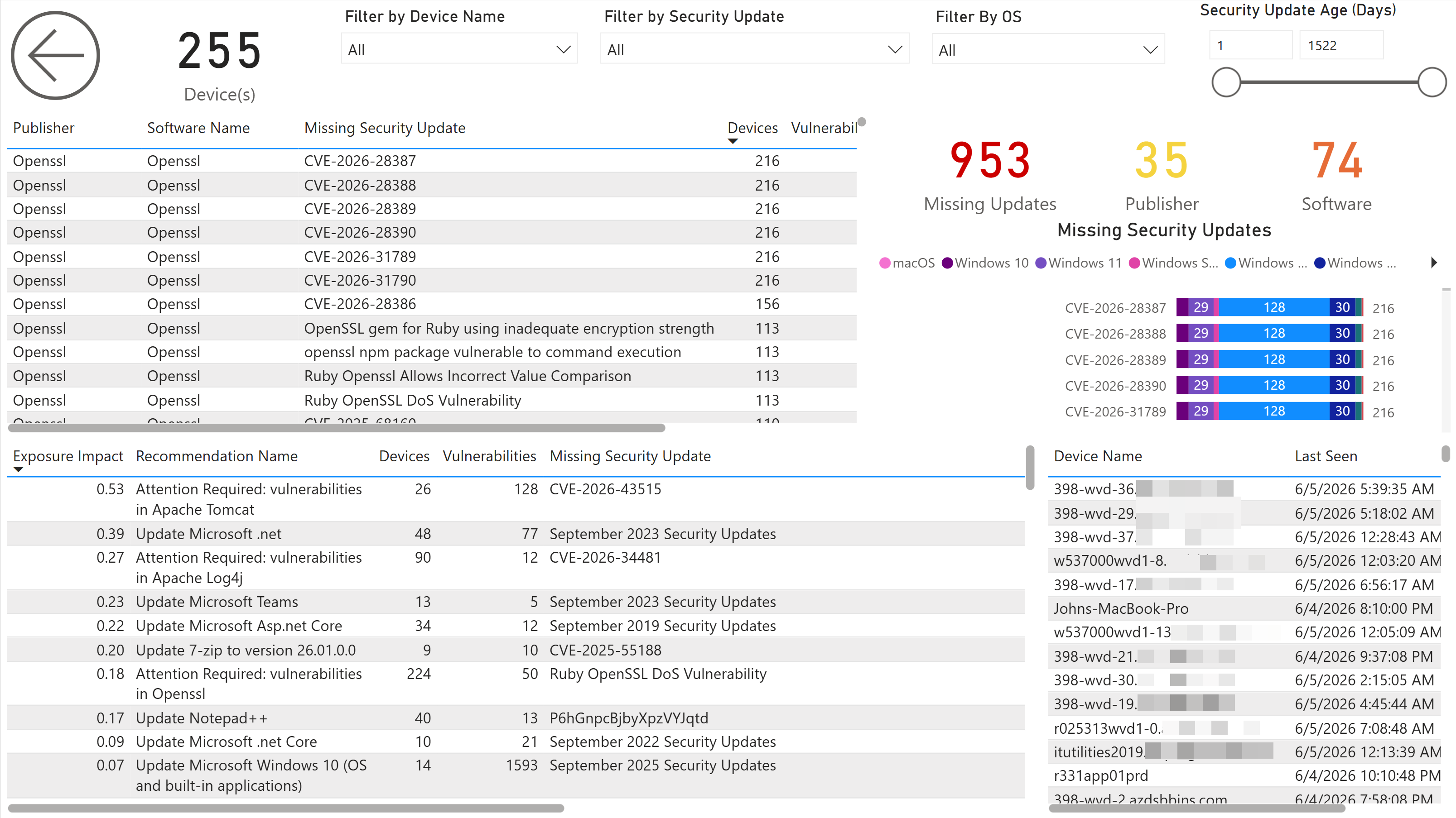
5. Patch lag: how long fixes sit open
Patch lag is how long a known fix has been available but unapplied across your fleet. It’s the closest practical proxy for mean time to remediate (MTTR), and it’s where most real-world risk accumulates. Knowing what to patch is only half the job; the other half is how fast you actually do it. The real exposure rarely comes from a vulnerability simply existing. It builds during the weeks or months it sits open before anyone applies the fix.
Set a target and watch the age trend. Many teams anchor theirs to public benchmarks: CISA’s Known Exploited Vulnerabilities catalog flags the bugs to fix first, and a common goal is criticals patched within 14 days and highs within 30. If update age is creeping up against whatever target you set, your remediation is falling behind your exposure, no matter how good your scanning is.
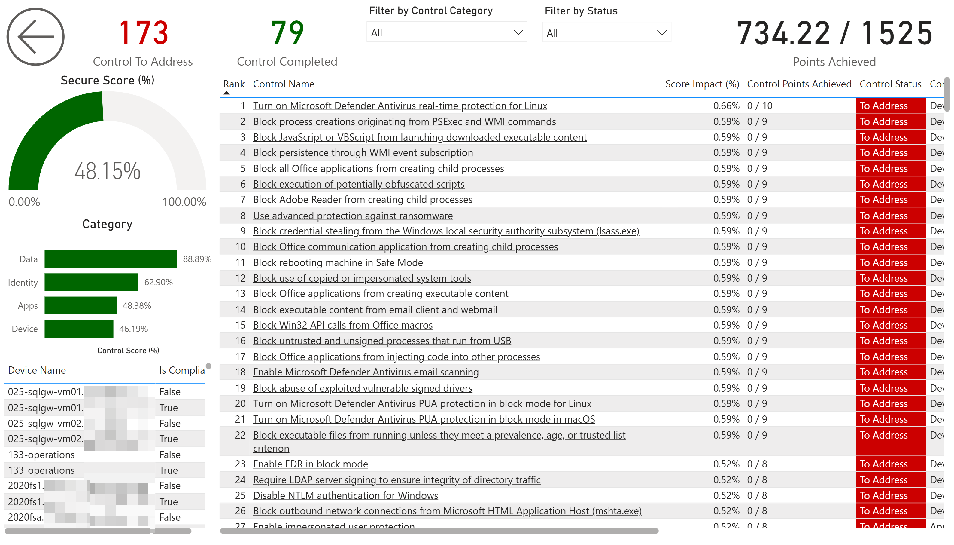
6. Secure Score and misconfigurations
Vulnerabilities are missing patches. Misconfigurations are the doors you left unlocked, and they’re just as exploitable. Microsoft Secure Score measures your configuration posture (attack surface reduction rules, firewall settings, credential protections, account policies) and splits it into what’s done and what’s still open.
Track the score, and more usefully, the specific controls dragging it down. A score of 54% means little on its own. “We’re missing attack surface reduction rules on most devices” is something a team can act on this week. Group the gaps by category (Identity, Apps, Data, Device) so you can assign ownership.
7. End-of-life operating systems and software
Nothing raises risk faster than software that no longer gets patched. An unsupported OS isn’t “a few vulnerabilities,” it’s a permanent and growing hole, because new CVEs against it will never be fixed.
Track end-of-life at two levels. Operating systems first: which Windows and Windows Server builds in your fleet are past or approaching end of support. That data is reliable and high-impact, and it’s usually the most urgent item on the list. (For a related example of surfacing at-risk devices ahead of a hard deadline, see finding devices missing the Secure Boot 2023 certificates.) Then applications, with one honest caveat: end-of-life dates for third-party apps depend on Defender matching each title to a known catalog entry, so well-known software gets accurate dates while obscure or in-house apps may show nothing at all. Treat app-level end-of-life as strong but incomplete, and never assume “no date” means “still supported.”
8. New vulnerabilities: your exposure velocity
Every metric above is a snapshot. This one is the trend that tells you whether you’re keeping up. Exposure velocity is the number of new vulnerabilities appearing across your fleet over a rolling window, for example the last seven days. Track it as your early-warning signal.
If new vulnerabilities are arriving faster than you’re remediating them, your backlog grows no matter how hard the team works. That’s the early warning to add capacity or tighten prioritization before the numbers get away from you.
Putting it together
The trap with security metrics is measuring everything and acting on nothing. These eight give you a complete loop: one number for the board (exposure score), a real priority queue (exploitable vulnerabilities and the devices they hit), a plan (prioritized remediation), a pace check (patch age and new-vulnerability velocity), and the posture gaps that scanning alone misses (Secure Score, misconfigurations, end-of-life).
They aren’t only a security story either. The same view lets finance see the return on patching effort, helps teams document risk-based compliance decisions, and gives leadership a clear “we’re focused on what matters most” narrative, all from one dataset. That kind of security and threat visibility is what most teams otherwise piece together by hand across exports and spreadsheets. (If you also run Intune and SCCM, the same approach extends to one pane of glass across all three.)
Want to see these eight metrics on your own fleet? BI for Defender connects to your Microsoft Defender for Endpoint data and surfaces exposure, exploitable vulnerabilities, Secure Score, missing updates, end-of-life software, and more as pre-built Power BI reports. No agents, no vendor portal, and your data stays in your tenant. Try the live demo or start a free trial →